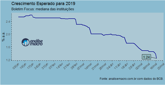
O boletim Focus, divulgado toda segunda-feira pelo Banco Central, trouxe o 12º corte no crescimento mediano esperado para o crescimento esse ano. Abaixo, usamos o pacote rbcb para coletar os dados diretamente do Banco Central. Em seguida, nós tratamos os mesmos, de modo a colocá-los em um data frame. Algo que ensinamos detalhadamente no nosso Curso de Análise de Conjuntura usando o R.
library(rbcb)
pibe = get_annual_market_expectations('PIB Total',
start_date = '2019-01-04')
pib_esperado = pibe$median[pibe$reference_year=='2019']
pib_esp_min = pibe$min[pibe$reference_year=='2019']
pib_esp_max = pibe$max[pibe$reference_year=='2019']
dates = pibe$date[pibe$reference_year=='2019']

data = data.frame(dates=dates, pib=pib_esperado,
min=pib_esp_min, max=pib_esp_max)
Produzimos um gráfico com o código abaixo.
library(ggplot2)
library(scales)
library(ggrepel)
library(png)
library(grid)
library(gridExtra)

img <- readPNG('logo.png')
g <- rasterGrob(img, interpolate=TRUE)

ggplot(data=data, aes(x=dates, y=pib))+
geom_line(size=.8, colour='darkblue')+
labs(title='Crescimento Esperado para 2019',
subtitle='Boletim Focus: mediana das instituições',
caption='Fonte: analisemacro.com.br com dados do BCB.')+
xlab('')+ylab('% a.a.')+
scale_x_date(breaks = date_breaks("4 days"),
labels = date_format("%d/%b"))+
theme(axis.text.x=element_text(angle=45, hjust=1))+
geom_label_repel(label=round(data$pib,2),
color = c(rep('black',1), rep(NA,nrow(data)-1)),
fill = c(rep('#91b8bd',1),
rep(NA,nrow(data)-1)))+
theme(panel.background = element_rect(fill='#acc8d4',
colour='#acc8d4'),
plot.background = element_rect(fill='#8abbd0'),
axis.line = element_line(colour='black',
linetype = 'dashed'),
axis.line.x.bottom = element_line(colour='black'),
panel.grid.major = element_blank(),
panel.grid.minor = element_blank(),
legend.position = 'bottom',
legend.background = element_rect((fill='#acc8d4')),
legend.key = element_rect(fill='#acc8d4',
colour='#acc8d4'),
plot.margin=margin(5,5,15,5))+
annotation_custom(g,
xmin=as.Date('2019-01-03'),
xmax=as.Date('2019-01-31'),
ymin=1.5, ymax=2)
Abaixo, o gráfico...
Isso e muito mais você aprende em nosso Curso de Análise de Conjuntura usando o R.